Research Associates, Senior Researchers, Research Director, Data & Technology Director, Director of Operations, President
Overview
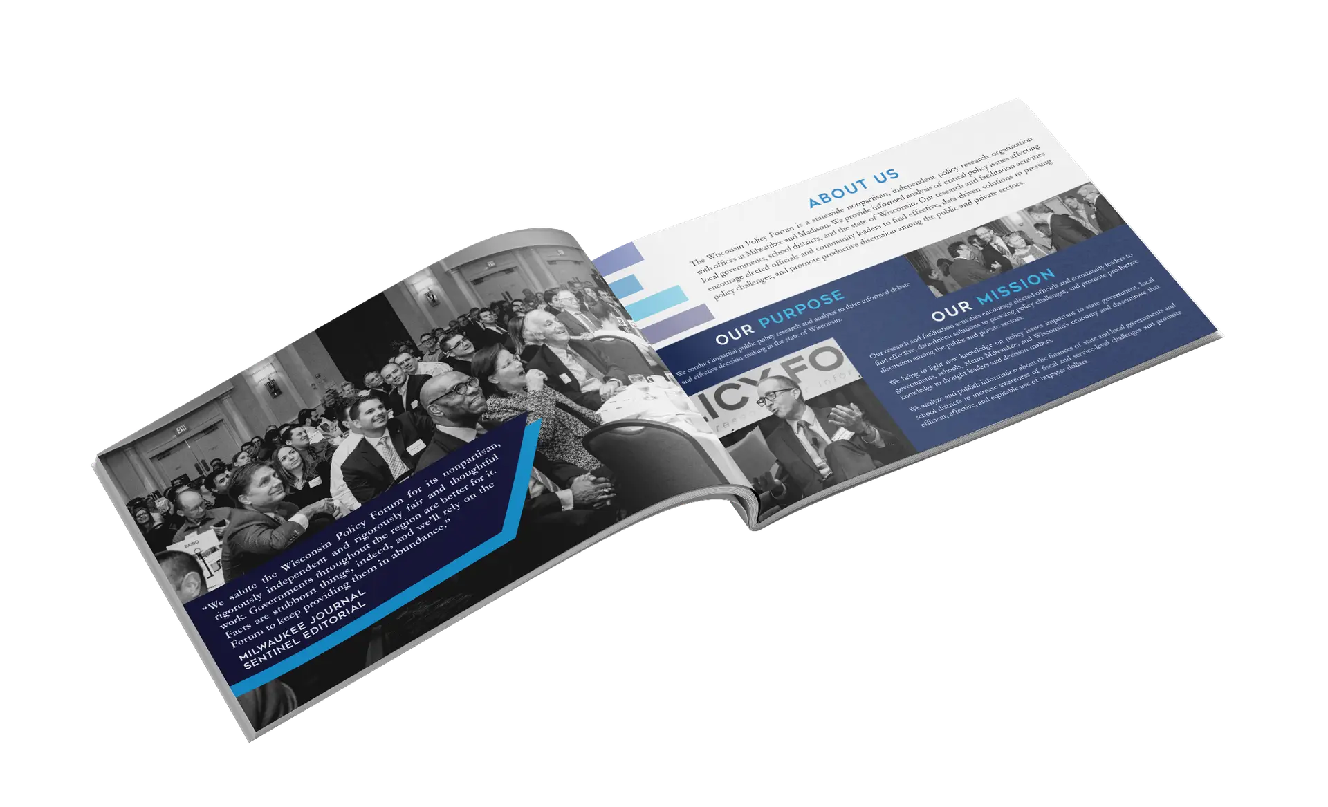
In 2018, the Public Policy Forum merged with Wisconsin Taxpayers Alliance to become the Wisconsin Policy Forum which required compelling brand standards and designs for the new company’s visual identity.
The Ask
Design a new, unified brand identity
Produce cover designs
for publications
Create promotional materials
Challenge
Visually merge two distinct brands into one cohesive identity.
Process
Research
To begin, I looked at the two individual brands and conducted research on additional Public Policy Forums throughout the United States. I noticed that many utilize blue in their brands, which often evokes:
1. Logic and Professionalism
2. Trustworthiness
3. Calm & Objectivity
These qualities communicate reliability and expertise to inform policy decisions. Blue is often paired with neutral tones, such as white and gray, to reinforce a sense of balance and authority.
Logo Symbol evolution
I wanted the logo to better represent the brand’s key words, which are “policy,” “impartial,” “balanced,” and “research.”
The early logo drafts consisted of incorporating lettermark or monogram design styles. Then, I experimented with pictorial styles, adding a visual representation of the type of work WPF conducts.
Eventually, the logo evolved into a simplistic building with columns that represents sturdiness evoking a sense of trust in the forum’s published works, and also appears as a research graph.
Final: Logo
Research
To keep the brand relevant and to enhance its overall presence, I modernized the outdated typography and completely overhauled the logo.
I removed the “space invader” icon, though recognizable, as well as the mountain icons (pictured below) because they did not align with the company’s focus on public policy and research. I also eliminated red as a brand color. These changes paved the way for a more accurate visual representation of the business.
By introducing a the multi-blue color palette and research-focused visuals, I successfully aligned the company’s new identity with their mission statement.
Below are the updated logos and to the right is the new color palette and fonts.
To keep the brand relevant and to enhance its overall presence, I modernized the outdated typography and completely overhauled the logo.
I removed the “space invader” icon, though recognizable, as well as the mountain icons (pictured below) because they did not align with the company’s focus on public policy and research. I also eliminated red as a brand color. These changes paved the way for a more accurate visual representation of the business.
By introducing a the multi-blue color palette and research-focused visuals, I successfully aligned the company’s new identity with their mission statement.
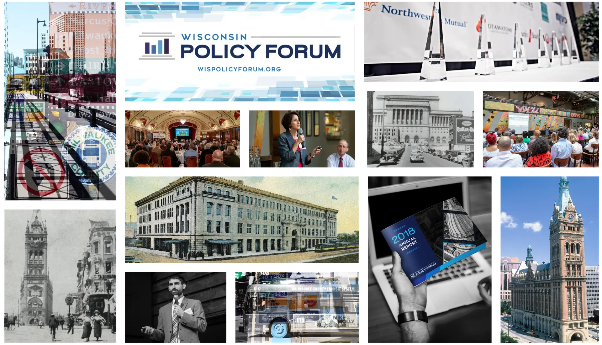
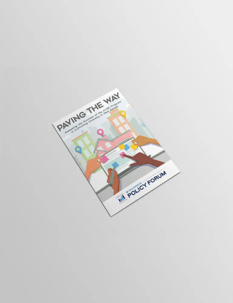
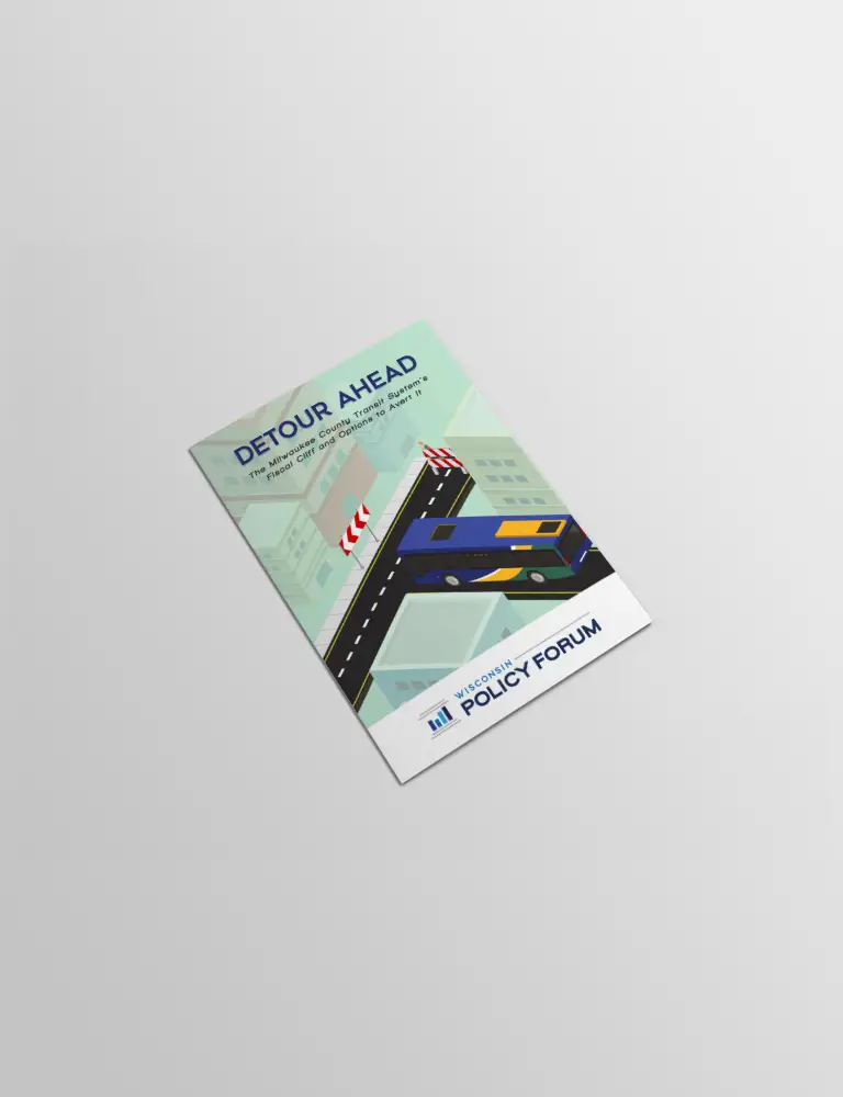
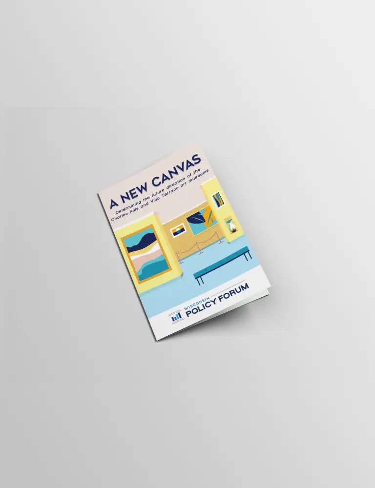
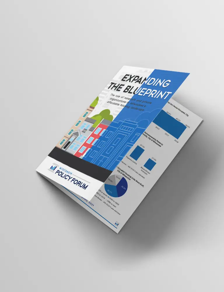
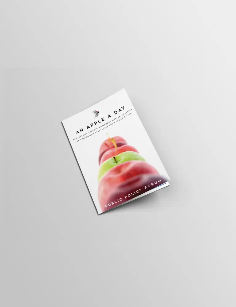
Displayed below is cover art from several reports I designed, including throw-back covers I worked on with the previous brand identity.
Please click on any cover to view the corresponding report on the WPF website.
Click the button below to explore additional work on the Forum’s research page.